What’s the story?
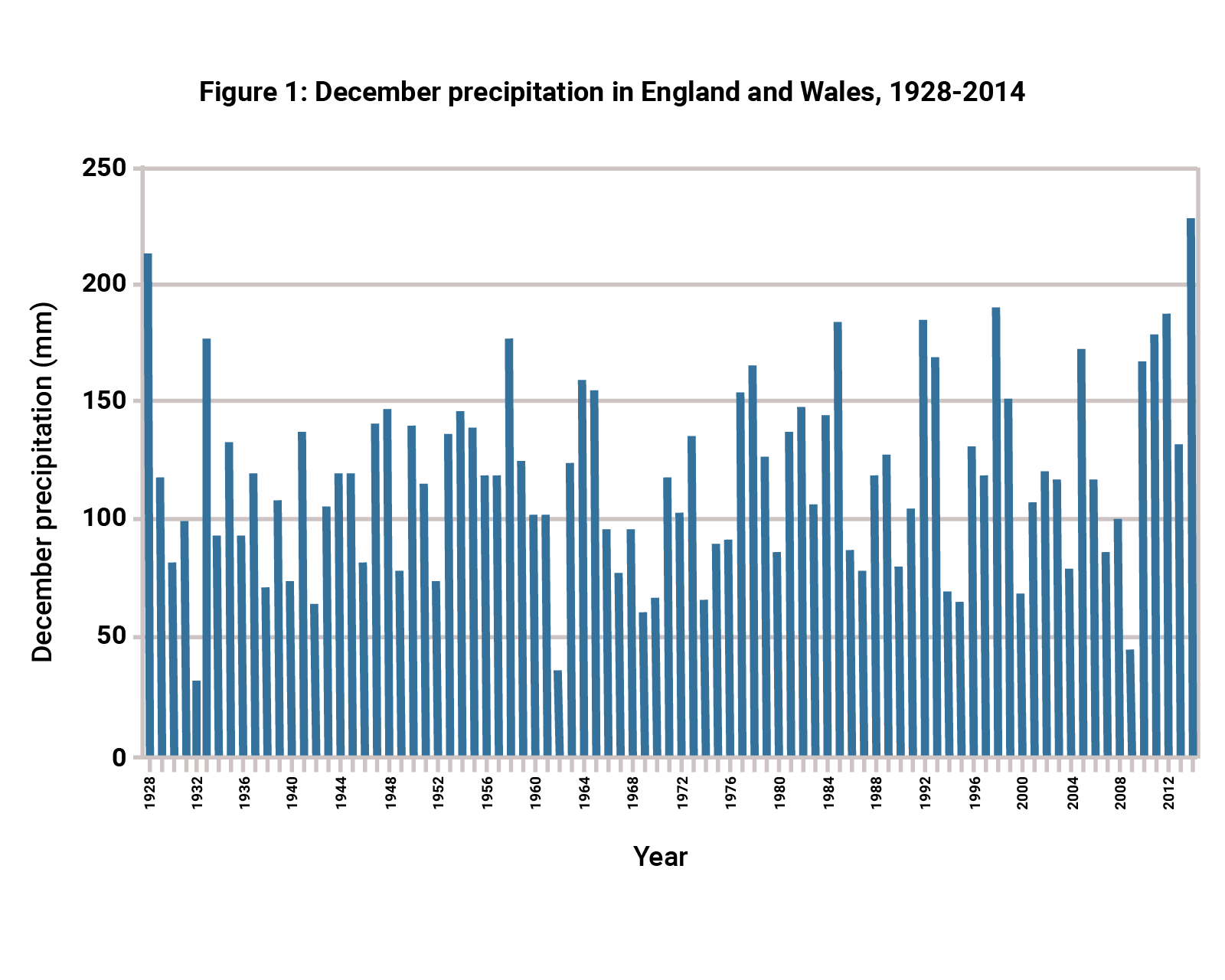
Select the three analytical statements below which, when combined, best summarise this graph’s overall ‘story’.

Quantitative skills check
Study the data shown in the graph then answer the questions.
When you have completed the task, click on the “answers" button.

| Question | Your Response | Correct Answer |
|---|
Answer:
Identifying the elements of a good AO3 response
Read the two responses to the following 5-mark AO3 question
Use the graph to analyse long-term changes in December precipitation in England and Wales.
Decide which is the best response.
After discussing the strengths and weaknesses of each answer, click to reveal an examiner commentary.

Response A
Overall the trend is unclear and there seems to be no permanent change. The maximum value is about 230 mm in 2014 and the lowest was 30 mm in 1932. There are many other highs and lows meaning that there is no long-term trend that I can see. For example, there is a low amount in 1962. There is a high amount of precipitation in 1958.
Examiner Commentary Response A
Although this answer correctly identifies the maximum and minimum, it is a shame that no effort is made to analyse the trend in high values (above 150mm) and acknowledge there is possible evidence of an increase. Overall, this is a poor answer to the question asked.
Response B
It is possible that December precipitation has increased slightly in recent decades. The value has exceeded 150 mm 11 times since 1976 but only 5 times before then. This could indicate a long-term trend towards higher precipitation. 2014 had the highest precipitation for the entire period (230mm). However things are made complicated by what could be a cycle (every 3-5 years) of an unusually low amount of precipitation in some years, most recently in 2009 (48mm). Moreover, very high values were recorded in the past in 1928 and 1933. Therefore while there is some evidence of a long-term increase, it is far from certain that a significant change is happening.
Examiner Commentary Response B
This is an excellent answer which uses the data to analyse possible evidence for a long-term change. Part of the challenge of this question is thinking critically about the strength of the evidence shown. This answer acknowledges that while there may be a possible trend, it is far from being compelling evidence. In contrast, Response A dismissed any possibility out of hand without offering a detailed analysis of the data. Response B also analyses the evidence for cyclical trends, or cycles, of higher and lower precipitation - good!
Analysing data concisely
A student has given a response to the question below, which has a tariff of just 3 marks. Their answer is excessively long. Your task is to edit the response so that it becomes as short and succinct as possible while still gaining the full three point marks.
When you have edited the text, add ticks where you think the 3 marks should be awarded.
Use the graph to describe changes in December precipitation in England and Wales between 1928 and 1962. [AO3, 3 marks]

Suggested response
The maximum precipitation of 215mm is in the very first year, 1928.✔[1 mark] Overall, precipitation keeps fluctuating with no real pattern, staying above 60mm but below 150mm in all but five years.✔[1 mark] But in the final year, 1962, it drops to a new minimum of about 35mm.✔[1 mark]
Mnemonic
Some teachers and schools encourage students to use a mnemonic when analysing a pattern or distribution: each letter of a word serves as a reminder of an analytical point that must be made.
One example is the OPPAD mnemonic.
Take every opportunity to practice analysing patterns shown on maps during your course.
You can apply the OPPAD mnemonic to maps in your text books, for example, and practice writing your own (maximum) 100-word analysis of what you can see.
| O | ✔ interpret the Overall picture or story shown (is it even or very uneven?) |
| P | ✔ analyse the Pattern, if one is present (is there clustering, or is a more scattered or random distribution shown?) |
| P | ✔ identify Place names worthy of special mention (e.g. the distribution may be clustered in a certain region) |
| A | ✔ identify Anomalies or map features which do not conform well with the general pattern (for example, volcanic hotspots on a world map of volcanic activity) |
| D | ✔ use Data in the answer (if the map has a scale then it is possible to estimate the length of a linear distribution of settlements, for example) |


